Design Thinking
CASE STUDY 1
Nemours Children’s Health
Creating and Implementing a Design System
The Ask: Rebranding of Nemours Children’s Health (second rebranding based on new logo and branding). I was asked to create a design system for Nemours web sites: Nemours.org; NemoursEstate.org; KidsHealth.org
• Components, guidelines, patterns, colors, fonts, UI elements
• Implement new site maps and architecture
• Wireframe and implement flexible Navigation and Footers
• Consistent visual design across all Nemours sites
• Collaborate on content strategy
• Collaborate with cross functional teams and agencies
• Build and launch experience in Adobe Experience Manager (AEM)
(Case Study 3 is the previous re-design / before)
After


A side by side look at 2 sister web sites and reusable components.
Create Styles Guides, Colors, Fonts, Buttons
100+ pages and counting

CASE STUDY 2
Nemours Children’s Health
Graduate Medical Education UX Design Journey
The Ask: Current state of Graduate Medical Education (GME) needs a revamp to responsive design.
• Create competitive analysis
• Implement new site map and architecture
• Art direct a photoshoot rather than using all stock photography
• Collaborate on content strategy
• Build a user-friendly experience in AEM
Problems:
• GME will stay on main site, not a sister site for the first MVP.
• Design site in Adobe Experience Manager (AEM) without developer support.
• No new navigation can be implemented, so create an intuitive landing page with existing components.
• Make sure there is a clear CTA, Apply Now, for all pages.
Outcomes:
• Upcoming students can more easily navigate to their section of study from a landing page.
• All the information about the programs, curriculum, requirements, living, salaries and how to apply are located on organized, scannable pages.
Future:
• Build a sister site, since Graduate Medical Education is not the same audience as Nemours.org.

Organize website in a sitemap to create structure and ultimately allow for easy navigation.

Whatever it is, the way you tell your story online can make all the difference.
New Graduate Medical Education Experience
CASE STUDY 3
Nemours Children’s Health
Develop a Responsive Site Framework (previously was Adaptive)
• Transform the site from a “brochure” to conversion-focused strategic marketing site (mobile first)
• Create a new design system, patterns, colors, fonts and illustrate custom iconography
• Build new site architecture and organization
• Establish clear call to actions to allow parent to schedule online appointments
• Site maps, wireframes, competitive analysis and style guides for various channels
Problems:
• We don’t have a call center and need different phone numbers for locations, doctors, and types of specialty care. The main call to action on pages became the phone number and the secondary button, online scheduling.
• Have supporting teams create and maintain 2 backend databases, for doctors and locations. This allowed us to use tagging, so if anything is changed in the databases, the changes automatically go live across the site.
Outcomes:
• Led to a 700% increase in unique visitors.
• In one month, the launch of the responsive home page redesign created 894 appointments
• 265 of those were new patients and 51% of those appointments were made outside of business hours.
(Case Study 5 we test online scheduling to make improvements.)

Before:
To convert an Adaptive informational site to conversion focused Responsive site, starting with a mobile first approach.
Usability test mobile concepts to gain insights from patients parents (main audience 18 - 46). Collaborative exercises with card sorting and concept sketching.
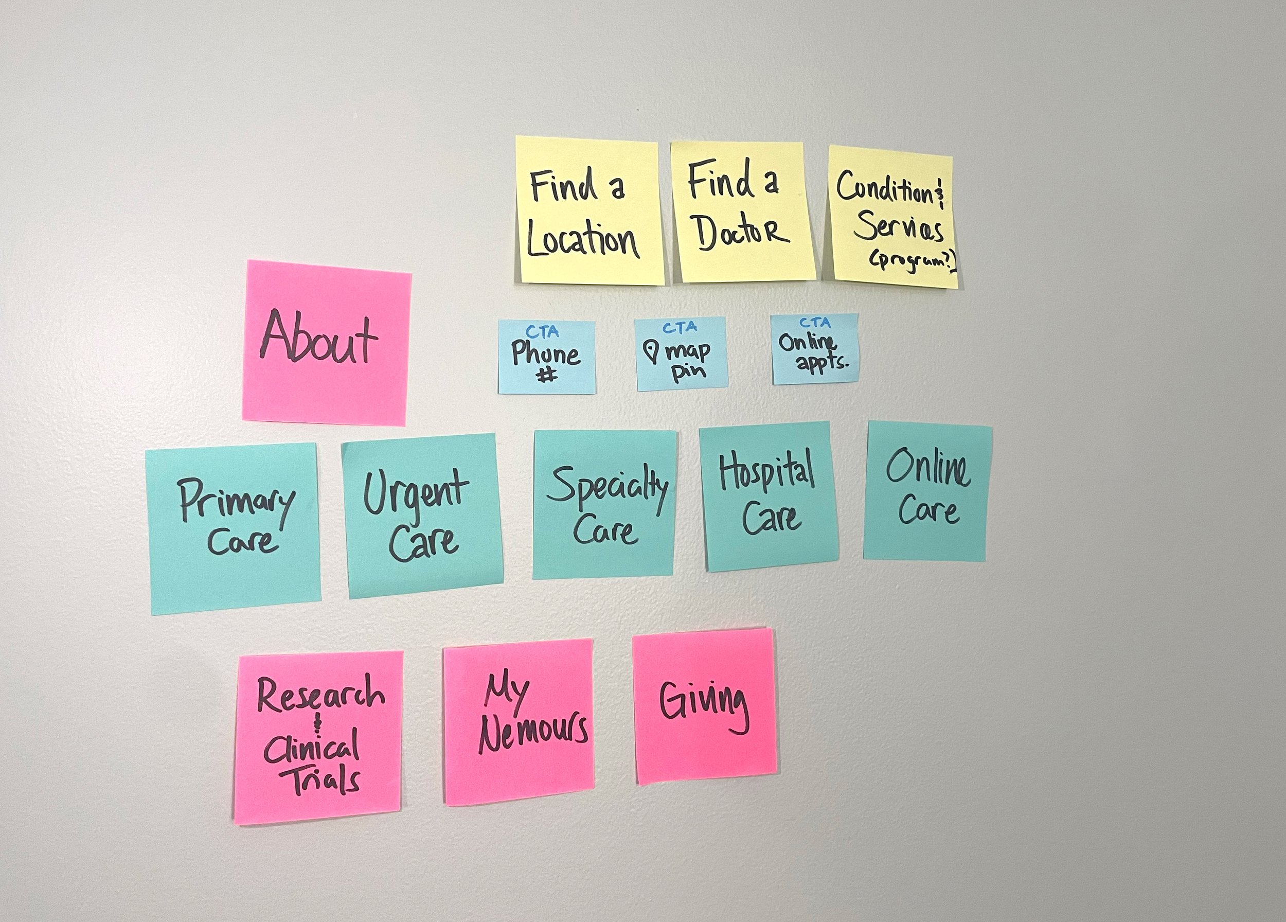
Card Sorting
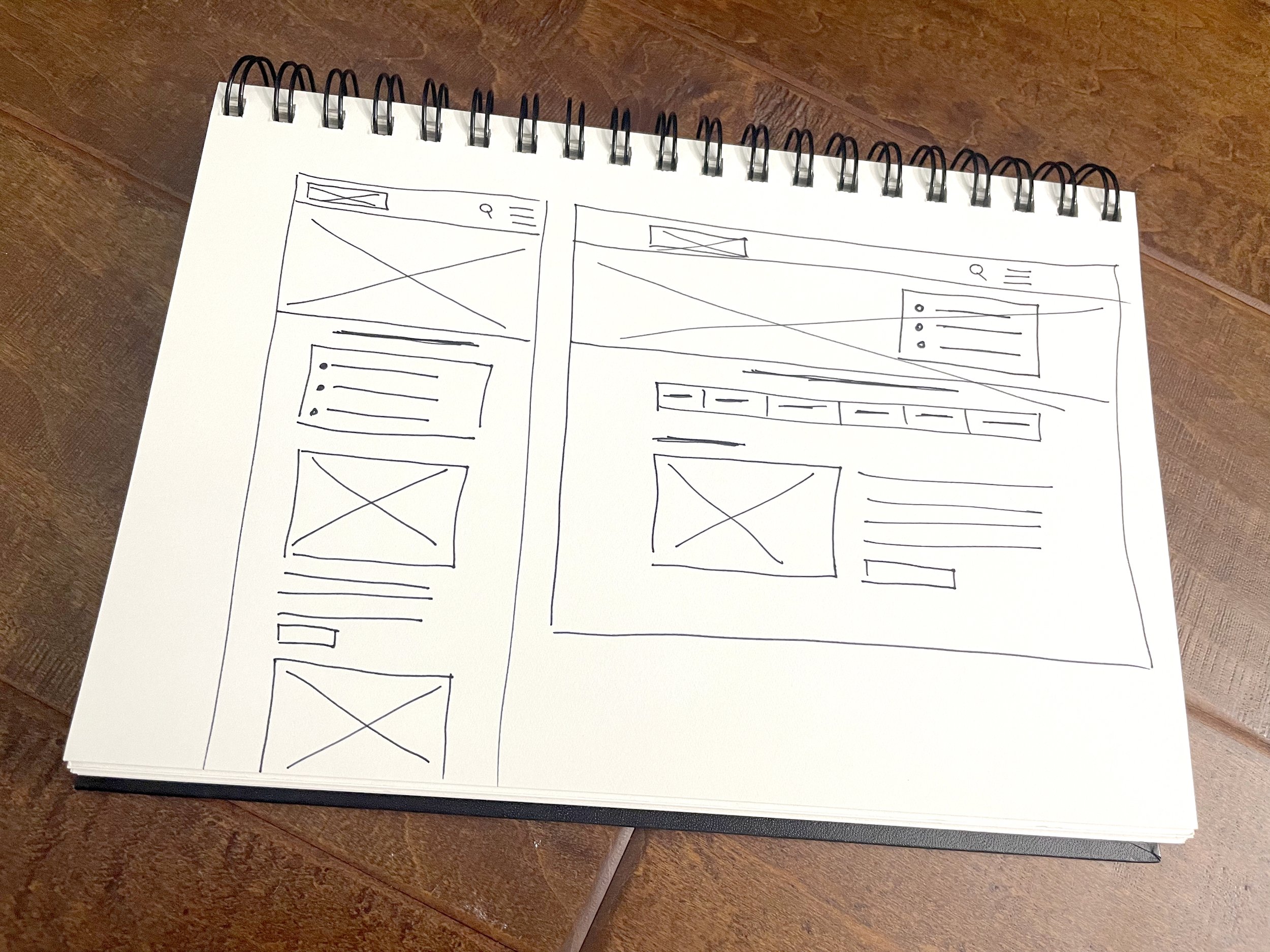
Wireframe Sketches

After


CASE STUDY 4
Nemours KidsHealth
Wireframes & Design
The Ask: Create a modern user experience that is WCAG friendly
• Develop wireframes to inform hierarchy, content and imagery.
• Collaborate with agency to develop reusable components across channels
• Update and implement content on third-party sites for purchase
Problems:
• All copy on the original pages are JPG graphics
• Page is a pinch and zoom, not mobile friendly

Before:
Updated original JPG graphics to rich text to improve mobile experience and SEO. The design helped to inform content and allow for content editors to effortlessly provide copy where needed.

Outcomes:
Developed wireframes to balance both visual design and content-friendly pages making the page scan-able and easy to read.
After sign-off, final content, cta’s and images were uploaded into AEM, 70+ pages were launched.

After
“Design is just not what it looks like. Design is how it works.”
— Steve Jobs
CASE STUDY 5
Nemours User Testing
Online Scheduling Improvements
Leveraging user testing we examined sticking points where multiple users addressed concerns. The design team collaborated on how to improve and implement changes to make online scheduling user friendly.
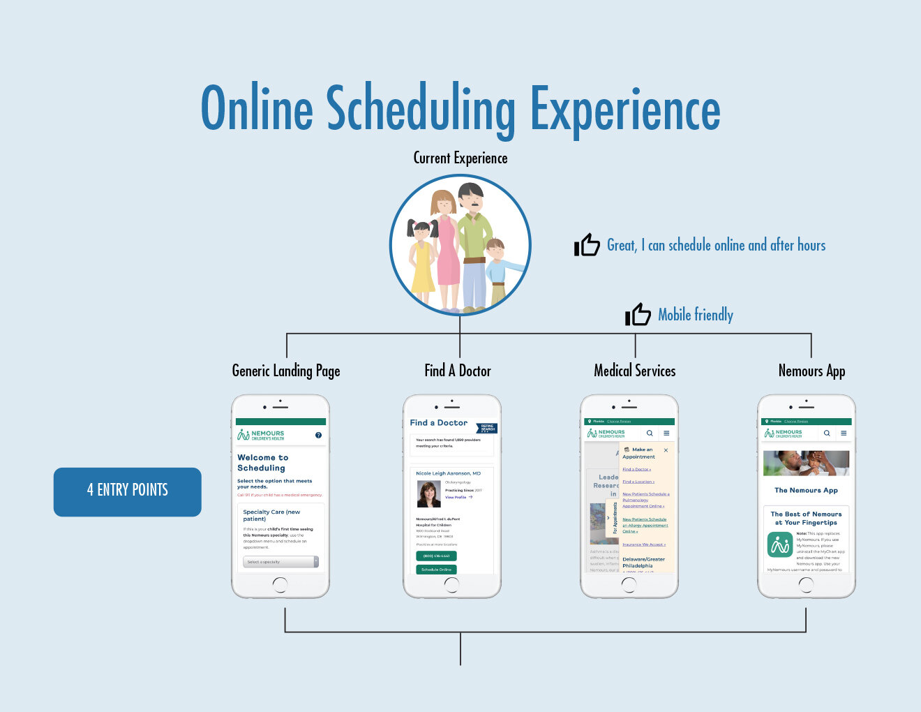
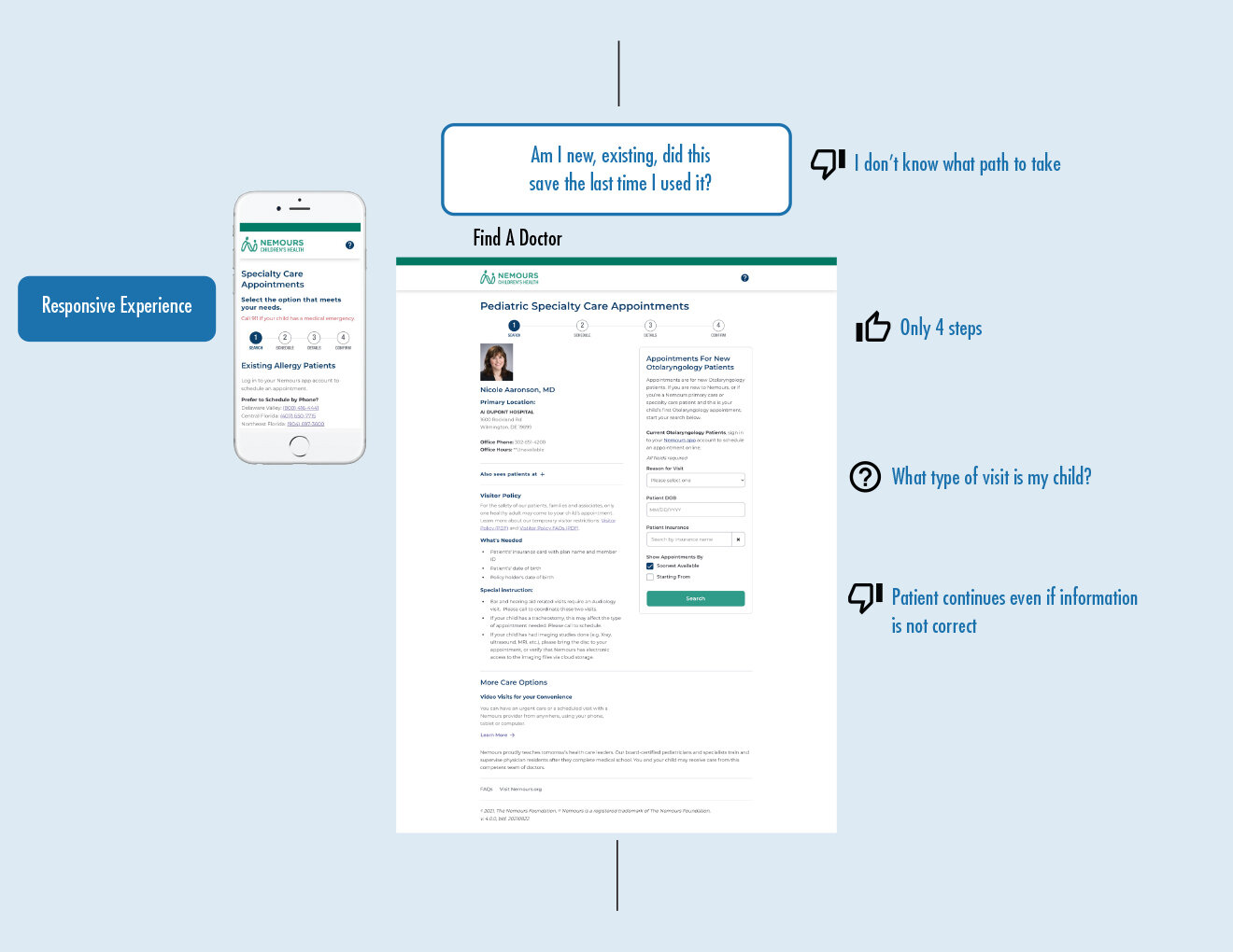
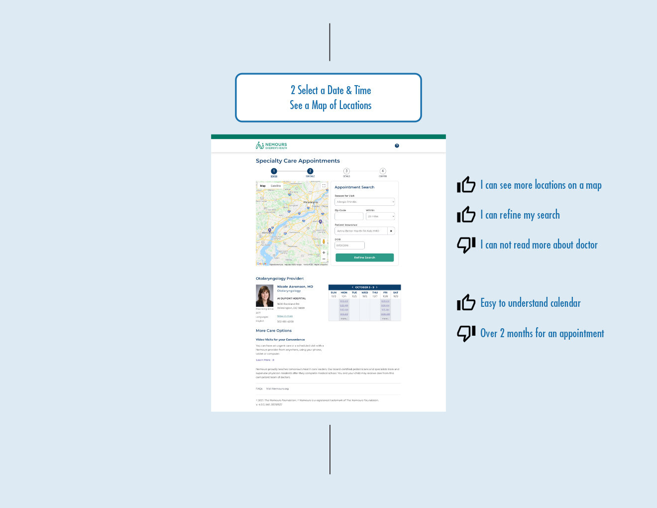

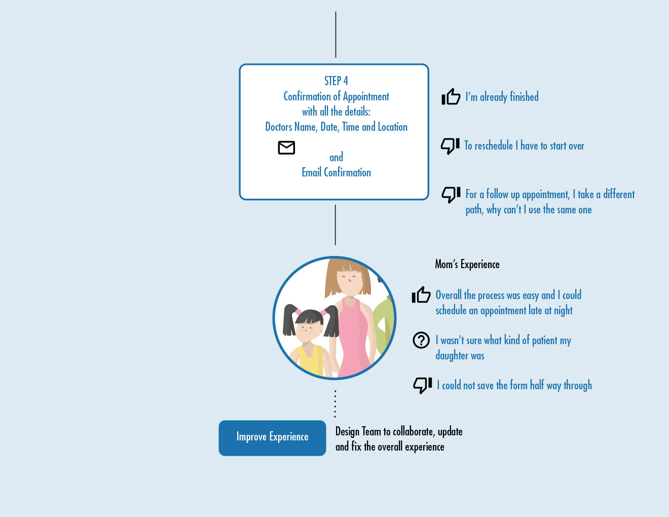
Summary: There was a need to create an intuitive patient experience. The goal was to clarify patient types and progress parents through the flow with less confusion. The ultimate goal was to make enhancements to the current experience, until all online appointments were via the Nemours App, where parents could have a logged in/saved state for appointments.
CASE STUDY 6
Citi
Marketing Campaigns
Implemented design thinking and WCAG (Web Content Accessibility Guidelines) to improve the overall design accessibility for marketing banners, home pages and overlays to create a seamless user experience.
Created templates, master pages, pattern library and shortcuts, effectively cutting hours by nearly 30%.
Partnered with multiple teams to organize the job request form, templates and style guides for all marketing requests, saving time and money for in-house designers and agencies.
Managed third party vendors and in-house designers, improving productivity and minimizing rework.


“Usabitlity is about people and how they understand and use things, not about technology.”
— Steve Krug, author